by studiotullia | Feb 5, 2022 | CURRENT PROMOTIONS, DESIGN & STYLING, DESIGN TRENDS, STUDIO NEWS, STYLE TIPS FOR DIY
I first found the mother load of vintage textiles at an estate sale in Astoria, Oregon, a few years ago. Thank God my father-in-law was persistent in finding this place; the shop of an upholster, whose estate was being liquidated.
It was like walking back in time, to the mid century, with hand written notes pinned all over the walls, leftover fabric bolts stacked up on shelves and in metal trash cans. It was definitely a hard-working artisan’s work room. His adjoining house was also for sale, so that was super fun to see his formal 50’s-60’s era living room and his immaculately upholstered pieces.
I was completely blown away by the quality of the thick, cotton velvet and the richness of the patterns and colors. I wouldn’t have expected this bold palette to be so prominent on the coast of Oregon.
I was later told by the owner of local store, Vintage Hardware, that he was the only upholsterer in the Astoria region for quite some time.
The bolts were at bargain prices. The gamble was that this upholsterer smoked. A lot. The pervasive smell of stale smoke was on all of the textiles. I also wasn’t sure how they would fare after I had washed them.
Once home,I threw some samples in the washer/dryer and was elated with what I found. The quality had endured and they were just as vibrant and beautiful.
I honed my ability to clean vintage textiles, determining that 1/2 cup of vinegar mixed with detergent was the best addition to a load of laundry, to remove the smell. Sometimes even a second or third wash was required, but ultimately worth it. It was no small undertaking to wash and handle these really heavy, wet velvets.
We even had to replace the mechanism inside our washer after a couple of intense weeks of washing, so there was that…
The other gamble was whether or not people would even like this dated, retro collection.
As with everything online it takes a few months for your items to be found…but eventually, they became quite popular and really are a bargain for the quality.
Here are a couple of pillow combinations that you could work.
A mix of the old with new, or high and low… is always nice and less predictable.

by studiotullia | Oct 17, 2018 | DIY, INTERIOR DESIGN
Here we are at week 3 and I have made some design decisions. The lighting and upholstery fabric have been ordered. But most importantly, I have started the mural! It’s like getting into a swimming pool; its a little hard at first and then you get more comfortable.

Be sure to check out what’s happening with the other ORC guest participants (tap the image above).
And to see some of the the featured designers at week 3 (tap the image below): 
There are so many talented folks who do this – you should grab a cup of coffee (or a glass of wine) and spend some time checking things out.
So, onward we go. I settled on a chandelier:
LIGHTING
This was what we had before:

And this is what I selected:

$297.45
Originally $729.35
There are a few chandeliers out there that I love (that cost a lot more) but ultimately to find something my husband and I both agreed on, and with the price being so right on this one, we went for it. I like that the shades are hand blown glass rather than fabric shades that gather dust. And I like the more modern look and black silhouette. I can take my time and wait to find a really amazing chandelier down the road.
UPHOLSTERY for CHAIRS:
I was going to go with a leopard velvet kind of like the rocker pictured below.
I needed something somewhat neutral that works with the black and white in the room on the loveseat and the sideboard.
STRIPED BLACK & WHITE LOVESEAT
BLACK/BROWN PERIOD SIDEBOARD:
I ultimately chose:
RED MILES TUMBLING BLOCKS by SCHUMACHER
It will breathe some new life into the room, I am hoping.
So, the inevitable needed to happen. The mural needed to begin and I have never done a mural before.
MURAL INSPO
JOHN DERIAN’s SWALLOW WALLPAPER:

and this lovely wallpaper mural by:

So began the custom mixing:

And the beginning application of paint with the roller:


And the brush (see our lovely temporary light fixture below):


My 11 year old daughter was helping me quite a bit with the sky and clouds. She has always been an artist…

By the end of the second day, it was looking more like Van Gogh’s Starry Night than what I had in mind.

I made the mistake of thinking that I could bang this out in a couple of 3 hour sessions and after two days, that is what it looked like.

I told my daughter I wasn’t happy with it and that I wanted to paint it over. She asked if she could play with it for a bit if I was planning to scrap it anyway. So she did. I swallowed my ego and admitted that I liked what she did with the clouds. She softened them and blended them better so they weren’t so animated. Then I realized that, as usual, I needed to slow down and take my time if I wanted to create something worth keeping. She is always telling me to slow down.
So needless to say the mural is still in the works.
We are in full swing now and I look forward to sharing my progress with you next week. In the meantime, you can follow me on INSTAGRAM
Let me know what you think and thank you for following along!

by studiotullia | Apr 28, 2018 | DIY, INTERIOR DESIGN

WOODLAND MOTIF
I came across this Woodland Hush Pattern on ETSY last night and decided to go for it. I feel it is finally moving me in the right direction. It will be used on one wall behind the dresser as an ACCENT WALL. As much as I love a palm motif, the more I thought about it, it wasn’t a great fit for the Northwest. And I really had a number of other factors that made it difficult to achieve – costs, time frame, etc. The fact that it has a deer family featured that is a metaphor for ours: parents with twins, was nice, too. I found it while searching for an evergreen stencil and decided to use it for the accent wall behind the dresser.

This pattern is provided by:

and needs to be installed with a pattern roller

and a foam applicator:

I haven’t looked at a tutorial yet. One step at a time.
I still love this gorgeous palette by ABH INTERIORS

I also really love this wallpaper of swallow tails by JOHN DERIAN that I considered for awhile. What a pretty color palette.

WALL COLORS…


TREE STENCILS
This past weekend at the coast also provided some inspiration as I was studying sky colors and tree silhouettes.


And still thinking about adding a tall tree stencil or two, but will have to see how far I get after I finish painting the walls. It has to be done right and may be too much.


LIGHTING
I also selected the 9 LIGHT 2 TIER CHANDELIER by HEISS. I can’t seem to transfer an image of this off of their site so you have to go to this link above to see it.
It was a compromise. My husband wanted glass shades rather than fabric shades for the chandelier and after lots of searching finally found this one. It was a great price on sale at less than $400 including shipping. I think it is transitional enough to feel more modern yet still work in our 100 year old house. And the oil rubbed bronze it not too formal which suits our family.
UPHOLSTERY
I also think I am going to go with this leopard velvet on the chairs, because to me it is a durable neutral. I know there aren’t any leopards in the northwest and I know my husband will hate it, so lets see if I can get away with it…


So, I am painting this weekend and really hoping to finish. That’s where I’m at. Way behind and feeling a lot like this:

Be sure to check out the other GUEST PARTICIPANTS:

As well as the DESIGN STARS. We are getting down to the wire here folks.

Thanks for following along as always.


by studiotullia | Apr 23, 2018 | DIY, INTERIOR DESIGN
I am going to keep this brief because frankly I am behind on this project and it all needs to come together in a few weeks. This is my current mood board although a lot hinges on my ability to get this wallpaper which normally requires a 6 week lead time. Waiting to hear back from Schumacher about this ZEBRA PALM in black on Sisal…
PLAN A:

It would be such a statement to have the ZEBRA PALM on one wall of my dining room where this dresser is…

PLAN B:
A decorative painted wall on one side of my DINING ROOM. The challenge will be to have it done in a tasteful way that I won’t get tired of.
I found this stencil on ETSY that I could possibly use:

Or this one:

In this color palette perhaps….

My inspiration for a wall mural and color palette comes from this lovely room by ABH INTERIORS using wallpaper from GRACIE STUDIO.


I just bought a 5 gallon tub of MOUNTAIN SNOW from METRO PAINT which is my favorite go to for a lovely white base coat at $65 for a 5 gallon tub! That should cover the orange walls.
So that’s where I’m at folks. What do you think??? Any comments, thoughts??? Please feel free to share.
Thanks for reading as always and have a great week!

by studiotullia | Apr 6, 2018 | DIY, INTERIOR DESIGN
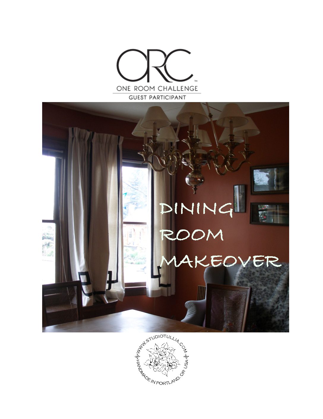
Well, folks, I’ve decided to sign up for yet another ONE ROOM CHALLENGE. This year’s challenge? MY DINING ROOM.

As much as these six week projects add serious chaos to our already hectic lives at the homestead, its all about the results. And the commitment to improve one more room in this old house. It makes us do stuff we wouldn’t normally get done, in a timely manner. Lets face it; the weekly accountability piece and the encouragement from watching other participants really helps. When I tell my husband, he rolls his eyes with a look of concern on his face, wondering I’m sure, what this is going to cost.
If you are not already familiar with the ONE ROOM CHALLENGE, it is a bi-annual event created by Linda from CALLING IT HOME that has been going on for thirteen years now. There are some seriously talented DESIGNERS that are asked to participate:

Over a hundred GUEST PARTICIPANTS like myself that must be design bloggers also volunteer to participate:

This is my fourth ORC. I will include links with the final results of my previous ORC rooms at the end of this article if you are curious.
So onward. Here is my very ORANGE dining room. It may be hard to believe this, but the dining room was this color when we moved into this house almost 12 years ago. Over the years, especially in the Winter, it really feels dark. I plan to lighten up the room quite a bit.
WALLS

INSPIRATION
Here are a few inspiration shots (from IKSEL DECORATIVE ARTS & de GOURNAY along with a few palmy rooms found on DAILY DREAM DECOR)


You see where I’m going with this, right?
LIGHTING
The BRASS CHANDELIER below was purchased for a steal at the REBUILDING CENTER in Portland and was supposed to be a temporary fix when we first bought this house. When you have twins, well, things really get put on hold. They are about to turn 11 now, so it really is time to start whipping this home into shape.
CURTAINS
The RIBBON CURTAINS were prototypes for possible curtain offerings via STUDIO TULLIA, my online store. The window seat and the bay windows have posed some challenges but really I have never been happy with the way they turned out so they are outta there.
FURNISHINGS
The dining table and chairs could use some TLC. They are 1950’s era Baker I believe. We picked the set up at an estate sale in San Francisco that came with us up to Oregon. I would love a new set but I don’t think the husband is going to go for it, so my challenge is to update/spruce up what we’ve got.

BUILT IN
I enjoy this built-in, but would like a nice contrast color and a new arrangement in there.

REUPHOLSTERY
We will REUPHOLSTER the Chairs for sure and hopefully address the wicker damage on some of the chairs.

The Love Seat in the background is also a vintage heirloom that I have reupholstered in back and white ticking. It will most likely need a SLIPCOVER.
HARDWARE/SHADES
I am going to to replace the CURTAINS, make them full length and change the HARDWARE. I am thinking SHADES on the windows may be the way to go.

UTILITIES/RETURN
And this HEAT RETURN is in bad shape, so that will also need to be replaced.

So that’s it in a nutshell.
Here are the links to the last two ORC final reveals:
ORC FALL2017 GUEST ROOM
ORC FALL 2016 HALLWAY/STAIRS
ORC SPRING 2016 CHARLOTTE’ S ROOM (it did not transfer to my new blog apparently…) I’ll have to update soon.
Thanks for following along and I will be back next week to share more.


by studiotullia | Nov 17, 2017 | DIY, INTERIOR DESIGN
 Well, I am SO happy to share with you some pictures from the ORC FINAL REVEAL of my upstairs GUEST ROOM!


I have to tell you that I really struggled with this room. I thought I had it all together and a couple days before the reveal I was NOT HAPPY with the results. I did a few things that turned the room around. The bedding felt lifeless, the room too traditional, and I was uninspired by the art. It was not cozy enough.
I added WHITE: white baskets, white duvet cover, shams and pillow covers from IKEA, fresh white paint on the trim, white lilies in a white vase. In an old house, in low light Portland, I have learned that nothing makes a room look fresh and modern better than WHITE.


I called my neighbor, Virginie Hoover, who had some lovely SHIBORI textiles she made this Summer that gave me the more bohemian/beach vibe I was looking for.


I went to GOODWILL for more frames and art, and printed some posters at WALGREEN’s from my Iphone pictures that were done in one hour. Fortunately, the local framers,I’VE BEEN FRAMED, were totally resourceful and accommodating and built some framing kits for me to assemble the art really fast.

My kids were the best, and helped me paint the dresser. I was up until 4 am the night before the final reveal day painting trim and doors. I was so exhausted and the extremely gray rainy day made it really hard to get any decent pictures. SO finally today the SUN came out here and there and I ran upstairs to try to capture the room. The night time shots I tried to take last night with artificial lights were horrible.
Something serendipitous always happens during a One Room Challenge when I go to Goodwill. This time I found a beautiful blue glass vase for $6.99 that had the original $59.99 price tag on it.

I also picked up a large framed poster really just for the frame but when I hung it up, oddly enough, the watermelon print grew on me and really kind of pulled things together.

SOURCES
Here are the SOURCES for the above room – I’ll do my best here:
PAINT COLORS:
WALLS – BENJAMIN MOORE MUSLIN
DRESSER – AMERICAN EMPIRE ANTIQUE, PAINTED BENJAMIN MOORE VAN HEUSEN BLUE with a few RESTORED CRYSTAL KNOBS from HIPPO HARDWARE
BOOKSHELF – IKEA
BELGIAN LINEN CURTAINS – WILLIAMS SONOMA HOME, with a few striped pleats added to the leading edges by STUDIO TULLIA
DOORS – BENJAMIN MOORE DOVE GRAY
TRIM – MILLER WHITE
SLEIGH BED – BERNHARDT, found for FREE, donated by a neighbor, on NEXTDOOR
GRAY SHAG RUG – IKEA
FRAMES – IKEA, except for the silver lead frames that are custom.
PHOTOGRAPHS – beach pictures taken with my Iphone and printed at WALGREEN’s except for VENICE Photos bought at Artists’ Co-op in Monterey, CA.
SCONCES – LAMPS PLUS
ACCESSORIES –
White vases, frames, white baskets- IKEA
Watermelon Print by MAZON found, blue glass vase and white ceramic sandpiper found at GOODWILL
BASKET HURRICANE – TARGET (found at Goodwill)
WOVEN BASKET BALLS – POTTERY BARN
Blue Striped Clay Bowl – GOODWILL
FAUX LLAMA FUR THROW & LINEN – custom made by STUDIO TULLIA
ALL BED LINENS – custom made by STUDIO TULLIA except for white linens – all from IKEA. The fabrics were found at either FABRIC DEPOT, THE MILL END STORE or PENDLETON WOOLEN MILL ENDS
The BUNNY HUTCH PILLOW on the chair is a HUNT SLONEM print from GROUND WORKS/KRAVET.
CRYSTAL LAMP – CRYSTAL REFLECTIONS, CA
LINEN SHADES for ANTIQUE CHANDELIER – AMAZON
FLOWERS, PLANT – TRADER JOE’s

by studiotullia | Nov 8, 2017 | DIY, INTERIOR DESIGN
THE ONE ROOM CHALLENGE was extended one week (for the first time ever due to all the natural disasters of late). This is WEEK 6 and the FINAL REVEAL will be WEEK 7.
EXCUSES
I apologize for a gap in reporting on my project.
Between the monthly flea market where I am a vendor.

and HALLOWEEN, it has been a whirlwind of muddy pumpkins, costumes and candy.
The visits to the pumpkin patch (twice):

The HOMEMADE Luke Skywalker and Princess Leia Costumes:


So, back to the room…
IKEA TRIP
No ORC is ever complete without a trip to IKEA and a night of Swedish Meatballs.

Besides walking throughout the entire store for inspiration, I needed to consider the baskets and the sheets:


Do you think we stayed too long?

GALLERY WALL
The gallery wall is coming together although I am wanting to replace the large beach image on the upper left. I don’t know that I can pull it off in time. I tried to incorporate Jimmy Smits from How to Get Away With Murder into the gallery wall last night. Love the pop of red and the dark contrast not to mention, el hombre guapo! See how that dresser is still very UNPAINTED.

I love the indigo blues and rich reds in this quick shot I took of a tanker in Astoria last weekend, but I want the picture to be more interesting.

After some perusing on MINTED, I found these:
San Francisco is only one of my favorite cities in the world. Which would you choose?
A)Overlooking the Golden Gate, where my husband proposed:
OR
B) Baker Beach, where we had our wedding pictures taken. They are both pretty wonderful. Which one do you like?

NEEDLE ARTS
Here’s a little embroidery project in the works that justifies occasional Netflix binging – it’s for the room also because you know, its all in the details.

I am incorporating some colors into the indigo mix to liven things up. This will be one more layer of interest along with some lovely Pendleton pillows.
CURTAINS
The rings have to be hand sewn onto the curtains as they are extremely heavy and the drapery hooks simply won’t do.

SCONCES
I am happy with the sconces for the price although I need some rods to hide the wires it would appear.

CRUNCH MODE
I can’t tell you everything…I have to leave some things a surprise.
What color will I paint the DRESSER? I am about to pull the trigger or in this case, load the paint brush.
And I have some painting to do this weekend on the doors and trim. We are down to the wire here. I was hoping for a glorious sunlit afternoon next week with the natural light just right to capture the room.

So, hang in there and next week I will show you what I’ve got!

And be sure to check out the FEATURED DESIGNERS via CALLING IT HOME’s website:

As always, thanks for reading along!