
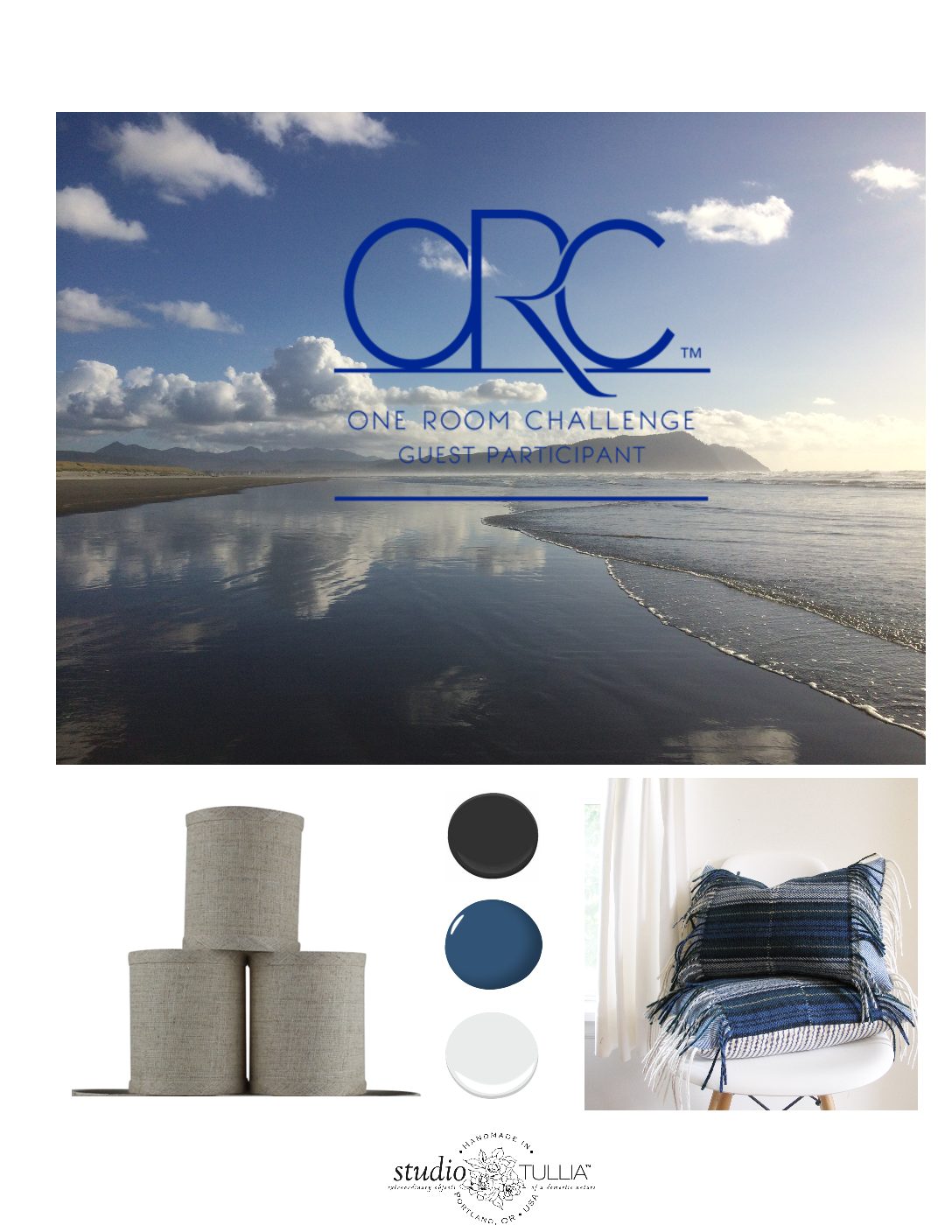
by studiotullia | Jun 21, 2019 | STUDIO NEWS
I’ve been sorting through A COLOSSAL PILE of textiles for the last couple weeks: specifically, BLUE & WHITES. I’ve never really organized it beyond a few curated collections over the years so I’m creating piles that work together stylistically and color wise. I’ve broken it down into a few different groups but obviously you can mix and match however you so desire. It is my intention to discount many of the ready to ship items on my ETSY store over the next couple weeks and refine and enhance the existing collections, with some great new additions.
So here goes:
INDIGO BLUES/BOHO:
Here is the stack below, in my kitchen, with my grandmother’s china on the wall and a larger plate I found at Goodwill.
Some new fabrics coming that are mixed in with the old:
I found this linen table cloth with exquisite embroidery in shades of blue:
COLLETTE DINNIGAN designed some new hotel suites two luxurious hotel suites at Bannisters by the Sea in Mollymook on the New South Wales south coast – as seen in VOGUE recently https://www.vogue.com.au/vogue-living/travel/inside-the-new-hotel-suites-designed-by-co
The BATIK FLORAL pillow in the loveseat outside my garage below has been a CUSTOMER FAVORITE for years, as it is for designers DINNNIGAN and SPIRO…
Anna Spiro creates the most beautiful interiors and exteriors (as seen above) using indigo, porcelain wares, vintage paintings and other unique finds. Staying at Halcyon Hotel in Australia is definitely on my bucket list.
This is a casual and comfortable style. Could be the Hamptons, could be the Pacific Northwest coast, or the Australian or New South Wales coast. Stripes, indigo batik patterns, blue and white ticking. Throw in the occasional hand embroidered piece, blue and white pottery, blond or lighter wood finishes, vintage paintings.
WATERY BLUES
I added another sub-category of the INDIGO BLUES called WATERY BLUES. As you can see it is inspired by the deep blue skies and oceans that look so gorgeous with indigo.
SUMMER to me is throwing on a pair of jeans and a T-shirt and heading to the beach. This collection captures that feeling. Just last weekend we were at GEARHART BEACH, our happy place.
SUMMER SALE
All ready to ship BLUE & WHITE pillows are up to 30% off. I am reworking/rebranding my website which will be ready in a couple weeks so my ETSY shop offerings are more current.
I will be givng away FOUR PILLOWS over the next FOUR WEEKS – check out my INSTAGRAM for details.
Thanks for stopping by and ENJOY YOUR SUMMER!

by studiotullia | Nov 7, 2018 | DIY, INTERIOR DESIGN
At last we have made it to Week 6! I’m excited to share some pictures with you below. When you have a chance, there is a plethora of fabulous ORC Rooms by Guest Participants and Featured Designers (click on the two boxes below to get there). Now that I am done with this dining room, I plan to spend some time there myself…


So, here goes. This dining room has proven to be a great challenge. The sun was spotty today in Portland so I did my best to capture the natural light in the room.
SKY MURAL

There is one accent wall where (with the help of my daughter and husband),I have painted a decorative sky painting.


My dear friend and floral designer Joann Andriese helped me to go for the large scale branches which I trimmed from my backyard. I reupholstered our existing dining chairs in Miles Redd Tumbling Blocks by Schumacher.

The chalkboard was created using a Portland flea market find (the carved frame), that I placed a chalkboard inside. I am not sure what it was before, but it seemed to have been built into a wall and was apparently salvaged and sold at an auction, per antique dealer, LOOKS & BOOKS, from Milwaukee, OR. The carving looked old world and reminded me of Italy. My daughter has been wanting a chalkboard for awhile. It has to cure for a couple more days when I initially posted this.


Here is a shot of the built-in which was painted a pale aqua paint to compliment the sky wall. It is full of various heirloom and contemporary dishes as well as crystal, vintage paintings and vases, an old clock and books.The chandelier is from FEISS. The plant from PORTLAND NURSERY.

Here is a more panoramic shot and you can see that I have panels flanking the bay window. They are custom made out of linen blend fabric called BUTE in Ivory from Cowtan and Tout, which is super wide and so gorgeous. The two pleats on the leading edge are striped cotton called ULLAKARIN from IKEA. The woven jute rug is also from IKEA.

This heirloom rocking chair I had reupholstered when I had twins out of a leopard velvet (like Jamil Natural). It was my great grandfather’s. The blanket is from salvaged PENDLETON.


I’ve been playing around with table placement so here you can see that I moved the table and chairs so they are horizontal to the bay window. It works both ways.


The abstract artwork is from TARGET. The heirloom loveseat was also my great grandparents that I had reupholstered in striped ticking.

Here’s a close up of the vintage dinner plates I found at an estate sale. The runner is also from IKEA.

The little lumbar pillow is FANTASY FOREST by SCHUMACHER , made by STUDIO TULLIA.

A detail of the curtains, also made by STUDIO TULLIA.


Here’s another shot of my kids’ favorite spot along with fabric Sonora by SCHUMACHER and a custom faux snow leopard throw which is also a favorite in the house.


The kids aren’t the only ones who like this spot.

If you look above the door there is another found painting that was framed locally by I’VE BEEN FRAMED, my go to local art store and framer. They frame most of my found art and prints as well as family art, photographs, etc.


Here is a detail shot of the rug and chairs.

And accessories.


And a shot of the table with candles lit earlier in the day when I had no sun.

I thought this brass napkin holder and napkins from IKEA were fun to add to the mix.

Here are a few before shots just so you can appreciate how far we have come from the original orange dining room.


Here the kids are priming the chalkboard for the first time with white chalk after it cured for three days.
The kids have been having fun writing menus and such on the chalkboard:

So, that is a wrap. The sources with links are listed at the end of this post.

I could not have pulled this off without my highly skilled husband, Shiloh. I am so grateful for all his electrical, construction and installation work.
Thanks so much for following along!

SOURCES
BENJAMIN MOORE – chalkboard paint
COWTAN & TOUT – Bute in Ivory for curtains
FEISS LIGHTING – Chandelier
IKEA – Lonholt jute rug
IKEA – black linen and Goddag woven table runners
IKEA – Tillstallning brass napkin holder & napkins
IKEA – Ullakarian Striped Fabric on lead edge of curtain panels
I’VE BEEN FRAMED – frames for vintage paintings
MILLER – gray paint by Joanna Gaines
METRO PAINT – Mountain Snow for custom paint mixing and base coats
PENDLETON WOOLEN MILLS – salvaged Pendleton wool for throw
PORTLAND FLEA – antique carved frame
PORTLAND NURSERY – houseplant
SCHUMACHER -Miles Redd Tumbling Blocks on Chairs
SCHUMACHER – Sonora white fringe fabric on pillow
SCHUMACHER – Fantasy Forest on accent pillow
STUDIO TULLIA – throw pillows
WS HOME – black candlesticks

by studiotullia | Oct 17, 2018 | DIY, INTERIOR DESIGN
Here we are at week 3 and I have made some design decisions. The lighting and upholstery fabric have been ordered. But most importantly, I have started the mural! It’s like getting into a swimming pool; its a little hard at first and then you get more comfortable.

Be sure to check out what’s happening with the other ORC guest participants (tap the image above).
And to see some of the the featured designers at week 3 (tap the image below): 
There are so many talented folks who do this – you should grab a cup of coffee (or a glass of wine) and spend some time checking things out.
So, onward we go. I settled on a chandelier:
LIGHTING
This was what we had before:

And this is what I selected:

$297.45
Originally $729.35
There are a few chandeliers out there that I love (that cost a lot more) but ultimately to find something my husband and I both agreed on, and with the price being so right on this one, we went for it. I like that the shades are hand blown glass rather than fabric shades that gather dust. And I like the more modern look and black silhouette. I can take my time and wait to find a really amazing chandelier down the road.
UPHOLSTERY for CHAIRS:
I was going to go with a leopard velvet kind of like the rocker pictured below.
I needed something somewhat neutral that works with the black and white in the room on the loveseat and the sideboard.
STRIPED BLACK & WHITE LOVESEAT
BLACK/BROWN PERIOD SIDEBOARD:
I ultimately chose:
RED MILES TUMBLING BLOCKS by SCHUMACHER
It will breathe some new life into the room, I am hoping.
So, the inevitable needed to happen. The mural needed to begin and I have never done a mural before.
MURAL INSPO
JOHN DERIAN’s SWALLOW WALLPAPER:

and this lovely wallpaper mural by:

So began the custom mixing:

And the beginning application of paint with the roller:


And the brush (see our lovely temporary light fixture below):


My 11 year old daughter was helping me quite a bit with the sky and clouds. She has always been an artist…

By the end of the second day, it was looking more like Van Gogh’s Starry Night than what I had in mind.

I made the mistake of thinking that I could bang this out in a couple of 3 hour sessions and after two days, that is what it looked like.

I told my daughter I wasn’t happy with it and that I wanted to paint it over. She asked if she could play with it for a bit if I was planning to scrap it anyway. So she did. I swallowed my ego and admitted that I liked what she did with the clouds. She softened them and blended them better so they weren’t so animated. Then I realized that, as usual, I needed to slow down and take my time if I wanted to create something worth keeping. She is always telling me to slow down.
So needless to say the mural is still in the works.
We are in full swing now and I look forward to sharing my progress with you next week. In the meantime, you can follow me on INSTAGRAM
Let me know what you think and thank you for following along!

by studiotullia | Oct 10, 2018 | DIY, INTERIOR DESIGN
Here we are at week two and I am excited to have settled on the color palette at least for the walls. We are gaining momentum on this project. For some reason, the ORC makes it all come together…

(Click on images above and below to see all the other designers’ projects)

PAINT

This week as been about getting the base colors for the room where I want them. I settled on A PIECE OF CAKE by Magnolia Home for the walls which is a light gray that looks taupe until it dries. It is a silvery gray. My husband thought it was the same color as the dry wall tiles he was installing on the ceilings. I have to admit he has a point, so this color required some serious convincing on my part.


It looks almost white during the day but as you can see below it is darker than the white wall on the left. For Portland winters I think it will stay light enough. We’ve already had some rainy gray days and it feels a lot better in the dining room already than the dark orange we lived with for years.
Below is pretty much what you need to paint. Blue tape and paper, spackling paste for patching walls, putty knife, sandpaper, brushes, rollers, paint cup, paint tray and liners, drop cloth, paint, a bucket of water and a rag.

I recommend buying the small color sample cans until you figure out what looks right. The space and natural light at your home is often radically different than in the paint store.

I chose SUMMER SKY by Metro Paint mixed with their MOUNTAIN SNOW until it was a very light sky blue for the Ceiling.

And for the built in bookcase I chose:
 RALPH LAUREN OCULUA BLUE RL1747
and

METRO PAINT MOUNTAIN SNOW $13/gallon! Recycled paint
You don’t need a lot of the teal blue relative to the white. I came up with something close to this color:


ACCENT WALL/SKY MURAL
I have been obsessed with sky and cloud formations all Summer in anticipation of painting the mural on the accent wall. Something like this sky wall by NEWALL is my goal:

I love the colors and swallows in this wallpaper by John Derian.

Here are just a few of the lovely skies captured this Summer – can you believe how brilliant blue the sky can be?

Gearhart Beach on the Oregon Coast:


Astoria, OR at my Father in Law’s Studio – my husband and kids are canoeing.

I had this vintage painting below framed over the Summer. It also captures the color palette I am after for this room. I chose a gray washed, simple, more modern frame than the original ornate gold one. What a difference!

Thanks for following along. See you next week.

by studiotullia | Dec 29, 2017 | CURRENT PROMOTIONS, DESIGN TRENDS
Well, folks, we have a new calendar for 2018!
This calendar has been digitally printed on a nice linen/cotton that makes for a lovely, soft, washable tea towel. It measures approx. 15″W X 25″L. We have hemmed it so that you may hang it up with a 3/16″ dowel and string. You can also just tack it up and that looks fine, too.
The Cloth Calendar is $24 including shipping.
If you want the Calendar with the Hanging Kit, the cost is $34 including shipping.
If you are handy at all, you can pick up your own two skinny 3/16″ wooden dowels, cut them to the desired width, attach a string at the top for hanging and wallah!

Here it is in my office. It was cloudy and rainy today so this was the best I could get I’m afraid.
The inspiration for this calendar was a vintage large scale rose floral print I found that looks like it is from the sixties. Given that Portland is the City of Roses I have been holding onto it and trying to figure out what to do with it so…

We had to figure out which section of the fabric to use which was challenging given the scale of the pattern.
Below is my fabulous assistant, Amanda, who is a constant help with computer graphics and design. (Sorry about the sun glaring in below).

Then we had to figure out the font, calendar numbers and graphics which took a few revisions.

I was trying to capture the fluidity of the artist’s hand on the roses with some added embellishments.

In the end, we settled on a bold font instead for the 2018, that to me has a retro look to it as I just wasn’t that happy with the hand written quality.
I think this is a really happy print, and not at all traditional, given the scale. About this time of year, we all deserve some bright blooms around the house.
I hope you like it!

Click HERE to purchase yours now
Thanks, as always, for reading, and HAPPY NEW YEAR!

by studiotullia | Oct 18, 2017 | DIY, INTERIOR DESIGN

And be sure to check out the FEATURED DESIGNERS via CALLING IT HOME’s website:

I’ve been moving right along with design decisions this past week…I’ve got the rug and sconces ordered and custom bedding and curtains designed and in the works.
I just want to say that in the midst of all this craziness, we had to go to the beach last weekend. And as much as I didn’t want to go, it was such a gift. Sometimes when you think you least need a break, is exactly when you need it the most. As a stay at home entrepeneur/Mom, this is really important to remember as I often resist stepping away from my work/life.
In addition to the herd of elk we saw on the way to the beach, there were only a handful of people there.

Gearhart Ocean State Park is one of my favorite beaches in the world. These images capture the feeling I am after in this room. An escape – with calming shades of blue, natural tones and soft textures.

We stay in Astoria a lot when when we go to the beach as the kids’ grandparents live there. It is a 15 minute drive from Gearhart. These shots below are classic Astoria as they always have the big international freighters waiting for clearance to go up the Columbia River. I’ve come to appreciate the patina of rust over the years.


Wondering if a couple of these beach images might come into play in the stairwell somehow leading up to the bedroom.
LIGHTING
As much as I had my eye on some outstanding artisan shades, Im thinking I will go in this direction, as they are more budget friendly and they tie into the linen curtains without competing with the sconces.

My final choice on the sconces:

TEXTILES
This is my palette for bedding and curtains:

And I am really excited to add some Pendleton in indigo hues to this mix. I love the texture of the fringe. Wait until you see the long lumbar “statement pillow” I designed, using scraps from “Pendleton by the pound” at our friendly Pendleton Woolen Mill End Store.

And I pulled the trigger on this runner from LOWE’s which will feel so good to step into in the morning.

This is where I am stuck. The DRESSER. I can’t decide which color to paint it:

1. BLUE


2. RED


or
BLACK


Please tell me – what would you do?
ART
I’ve got my art all picked out as well for the salon style mini gallery I will have behind the TV. I have a nice watercolor of the beach and I’m having a pair of Abstract Venice Canal photographs framed. I stole this large beach print from the hallway as it works so well with my theme and I had a great replacement for it anyway.

Seriously, help me out on the dresser. Of course, my husband says refinish the dresser, but I really want to paint it.


by studiotullia | Oct 28, 2016 | DESIGN TRENDS, HOME IMPROVEMENT

Well here we are at WEEK 4 of the ORC. I am at a rather difficult stage of this project.
PAINTING OVER THE ORANGE WALLS

The orange walls have required at least three coats of white paint and I’m not even sure that’s going to do it. I still have to paint the trim on the doors and the stairs.
My intention is to finish those by the end of the weekend. We’ll see how that goes. This is after one coat so you can see what we are dealing with.

That old trim is looking pretty funky.
Trying to see the light at the end of the tunnel.

The pictures for my gallery wall are being matted and assembled this week.

I ordered a runner from West Elm and I’m hoping it’s everything I want it to be

Once I have it, I can figure out the door paint colors
So I’ve definitely got my work cut out for me NEXT WEEK.
I’ll be painting the dresser and selecting new hardware…

My husband’s job is to install the lighting and assist with painting. He is a seriously speedy champ on the paint roller.
We also need to restore the floor at the bottom of the stairs. It is the scariest thing we found when we pulled up the rug. This area is also the entry into my home office so I thought it needed something.

I found an awesome stencil on Instagram from HEIRLOOM142 . It is coming from Canada so I hope it gets here in time! They shipped it out the next day which I really appreciated.

I’m stressing out this week so wish me good luck.
Grab a huge cup of coffee (or wine if that applies) and follow along with all the other DESIGNERS and GUEST PARTICIPANTS

Thank you so much for taking the time to read my post. I’ll talk to you next week!
Best,
Suzanne
![ONE ROOM CHALLENGE 2016 -WEEK 6 of CHARLOTTE’S ROOM FINAL REVEAL!]()
by studiotullia | May 13, 2016 | DESIGN TRENDS, HOME IMPROVEMENT, HOUSE TOUR: Traditional Spanish Style House near Pto. Vallarta, INTERIOR DESIGNERS THAT INSPIRE
Well, we managed to finish up just in time! Here are the results. We were lucky to have a bright sunny day for these last minute pictures, thanks to my amazing assistant, Amanda. Everything is smelling like roses and I am drinking a gin and tonic as I write this (it is after 5 pm West coast time, FYI).
FINAL REVEAL:

Below is a painting of our backyard fig tree that Charlotte and her friend Alex painted together last year. I floated it in one of IKEA’s shadow box frames.

As you can see we have a little woodland theme going on with the deers and bunny rabbit. I know the rose floral shade on the sconce and bed linens from IKEA are a departure from the neon splatter, but it was such a lovely pattern we bent the matchy matchy rules. Perhaps bold colors or solid colored linens would have worked better, but we wanted to make these work. They’re cozy and a little English or something. The framed deer art is hand cross stitched by a very patient Oregonian: a vintage find that was in perfect condition. The antique bed is an heirloom from my grandparents that my Mother stripped and refinished years ago.
The large splatter pillow was a trial run before the curtains and the hand drawn critter pillow Charlotte drew awhile back as a prototype for a school auction project. The cross pillow was from STUDIO TULLIA inventory and we liked it in the room.
You can see a little bit of the furry stool we created by covering an IKEA stool. It is the perfect little occasional stool for this tiny room and adds some much needed glamour.
I want to show you a close up of the white bunny painting by Oregonian artist ELIZABETH SEE because she is so talented. We have come quite a ways in just a couple weeks. Here are a few before shots:


Getting that pink the right color took some work. Between BENJAMIN MOORE PAINT and METRO PAINT we got it done.
The IKEA curtains were perhaps the funnest part of this project and they really set the tone for the room.
This IKEA PS 2014 ceiling pendant is very cool in its design. The pull factor really is fun at night and gives you a diverse range of visual effects. Her twin brother Arthur is a little jealous when it comes to the light. Thank God they have lego building experience as they put this thing together all by themselves. Whereas that project might have put me right over the edge.

This is her bookshelf which I have staged for this shoot. The camellias ,roses and hydrangeas are from our garden. The amethyst cut crystal vase was her great grandmother’s and the other vase is a hand painted vintage vase as well. The flower etched globe light is from IKEA. And we all know that’s an AMERICAN DOLL in a wheelchair. The one thing in the catalog Arthur liked because it had wheels.

HARRY POTTER books without their covers aren’t so bad looking next to the collection of NANCY DREW books.

All of the pillows in this feature have been provided by my primary sponsor ~ STUDIO TULLIA! Vintage ones (like the cool beaded rose pillow above) as well as other vintage oddities are available through TULLIA MARKETPLACE, which is not fully off the ground, but should be by this Summer.
Here are a few more pictures of the flowers up close because they are just so pretty. The vase is by who else…IKEA. The little painting is by Charlotte.


A FEW MORE NOTES…
We decided last minute to switch out her side table form TARGET and it needed to be white. The finish was antique gold and it just fell flat in the corner. We almost painted the gold framed mirror, too, but decided it added some bling and was ok as is.

This room was a quite a challenge because in all honesty this room is a dog. The room is tiny, the ceiling is slanted, the windows and trim work are funky, and many more issues I don’t need to bore you with.
The good news is that this is the room she wants to be in and is a very happy girl. She could not fall asleep last night she was so excited. I hated to wake her up this morning. This room is her safe haven, compared to the larger guest room where she was temporarily staying during this project.
 Sweet Dreams, my Sweet Charlotte.
I am excited to grab a cup of coffee tomorrow morning and indulge myself in the many final reveals as part of the ONE ROOM CHALLENGE, thanks to CALLING IT HOME.
This was a great challenge for me and 6 weeks was just about right. I am excited to do another room in the Fall.
Here is the link to twenty very talented designer bloggers’ final reveals HERE

And if that’s not enough, there are over 1,000 Guest Participant Final Reveals to view HERE:

Thanks so much for following along!
Best,
Suzanne

by studiotullia | May 5, 2016 | DESIGN TRENDS, HOME IMPROVEMENT, HOUSE TOUR: Traditional Spanish Style House near Pto. Vallarta
Well, we are coming into WEEK 5 with one week left to go. It has not been glamorous: its been about painting and electrical, but it is almost done!
My husband spent half a day last weekend putting in the electrical for the ceiling pendant in Charlotte’s room and while he was at it he upgraded our smoke alarms upstairs which felt good to check off the list.

As you can see, we got the walls painted and just have the trim left to paint. It took a little work to get the lilac and pink right. I think they are not too intense and balance each other out pretty well.

We still need to add trim to this one wall. Don’t ask me why it’s not there. That is how this house rolls and has for several decades.
Hope Hubbie can find the plates for the switches and outlets. I got the curtains hemmed and just need the hardware installed. Oh honey…

Yesterday we assessed where we are with ART, PILLOWS and BED LINENS.
She got this in MEXICO:
There is never a shortage of pillows around here. The splattered one was made up using leftover fabric from Charlotte’s curtain project.
We might paint the frame on this mirror. Haven’t decided yet.
We have this large vintage cross stitch piece that I found at a rummage sale that Charlotte loves. 
It sort of ties in with the bed which is an antique from my grandparents.
And, here is another lovely Mexican textile to add to the mix.

To check in on the ORC Featured Designers, go HERE

And, to see the ORC Guest Participants, go HERE

So, there’s a lot to do still, but we are going to pull this thing together by next week. Until then….have a great rest of the week.
– Suzanne

by studiotullia | Apr 28, 2016 | BENEFITS & GREAT CAUSES, DESIGN TRENDS, HOME IMPROVEMENT, HOUSE TOUR: Traditional Spanish Style House near Pto. Vallarta
Things are getting real here, folks, with only a couple weeks left. Our goal is to have electrical, painting, curtain installation and most of the furnishings in place by next week. That will leave the last week for bed linens, art, styling and the photo shoot.
Check out the GUEST PARTICIPANTS HERE
And check out the FEATURED DESIGNERS HERE

There are some wonderful projects going on so take a peek.
SPLATTERED CURTAINS
If you recall, we have been discussing Charlotte’s curtains and I had some serious concerns about the outcome…
Well we decided to dive in one recent afternoon. Starting with the three neon paints dyes (with glitter) I made her do a few practice runs, trying different brushes and splatter techniques.
We put a tarp down in the back yard and laid the two cotton curtain panels on it.

We got out the neon dye colors:

And, here she is giving it a whirl.

Lots of mixing going on…

After a few practice runs on scrap fabric, and before we even started on the curtains we had to run back to COLLAGE, our local crafts store to get more paint! 
By the time we got back with SEVERAL more fabric dye colors, it was starting to get dark!

The paints and splattered textiles were even beginning to glow. We had to hustle as I was not setting all this up again. I didn’t want her to over do it anyway.

She was able to get it all done before it was too dark and we were really happy with the results:
 I am also making a euro sham for her bed out of a couple of the scrap pieces. All in all it took about two hours.
UPHOLSTERED STOOL
We needed to find some sort of small chair or stool for her room and I came across this one while shopping at FABRIC DEPOT. I picked it up to look underneath and drum roll please… it was from IKEA!

So back to IKEA I went and got this for $35.

I had some leftover white fur from my pillow line on ETSY so I am using that to cover the stool.

Here’s the fur we used although it is more white – Arctic Fox white. We are going to decide later if we want to paint the legs or leave them black.

Here it is…what do you think? This puppy could use a little trim/combing, but not too shabby:

TEXTILES & PENDLETON:
I was shopping at Pendleton Woolen Mills and came across this interesting turquoise plaid that I thought might be a colorful blanket. So I am keeping that in mind at $60/yard.

Here is one of the PINK CROSS pillows available at STUDIO TULLIA on ETSY that we are planning to use on her bed.

And I am just starting to think about art, although she already has quite a bit of her own to work with. I just think these are lovely.

And lastly, think it would be fun to paint her door this rose quartz when we get to the hallway outside her room.
Wishing everyone a great few last days of the week.
And, thanks for reading!
Best,
Suzanne
![ONE ROOM CHALLENGE 2016 -WEEK 6 of CHARLOTTE’S ROOM FINAL REVEAL!]()
by studiotullia | Apr 22, 2016 | DESIGN TRENDS, HOUSE TOUR: Traditional Spanish Style House near Pto. Vallarta
I put a little collage together of all of our IKEA purchases for Week 3. See previous blog post for greater details about our shopping adventure HERE.

Grab a cup of coffee and follow along with all the amazing projects going:
ORC Featured Designers
as well as the: ORC GUEST PARTICIPANTS

See you next week!
Suzanne

by studiotullia | Apr 21, 2016 | DESIGN TRENDS, HOME IMPROVEMENT, HOUSE TOUR: Traditional Spanish Style House near Pto. Vallarta
 We decided to get some shopping done for the essentials of the room: lighting, hardware and curtains. I wasn’t sure how much input to let Charlotte have, but for the most part she picked some essentials I couldn’t find too much fault with. I just had to keep reminding her that the room is small so we couldn’t go too loud or crazy.
So here’s what we accomplished in less than two hours at IKEA:
LIGHTING:
She picked this floral etched glass KNUBBIG globe, which is a pretty accent light for the bookshelf. It has a subtle cherry blossom motif which is in keeping with our theme.

We finally decided on this chandelier by DAVID WAHL. I am curious to see how it looks installed. We chose the turquoise inside rather than the orange.


I like that you can easily pull on the cords to control the amount of light into the room.

Then we chose this RODD sconce that we paired with the EMMIE BLOM shade which has a nice floral pattern:

They had it on display and we liked it. We are from the City of Roses afterall.

Next we moved onto…
HARDWARE & CURTAINS:
This is the look we were after with the grommets. We chose the MERETE cotton curtains which are a nice weight cotton.

We also wanted sheers so we picked the LILL lace curtains:


We went with the VASENTLIG ball finials and double curtain rods:

Pretty basic choices, but I feel good that we got those items taken care of. It gives my husband some time to install the pendant and sconces as well as the curtains rods.
We are still painting the walls and hoping to have that done soon. And, Charlotte plans to splatter the curtains…oh boy.
I loved this chair but it is too big.

We also considered this one at VINTAGE VINTAGE on Division St, but again too big.

Would you look at all the carts at IKEA! We were leaving as they were closing up.

Well, thanks for reading and we will see you next week!
Best,
Suzanne

 Chronicles from A Well Lived House...


